next blog entry: what did I learn: from what I created.
One of Joan’s exercises was for us to put up our pieces from the 4 days and see what we had actually done. What threads, themes, etc were showing up?
And then, to get us thinking more creatively about our own work, she gave us a starter list of adjectives to help us describe what we were seeing. Then, if that wasn’t enough, we each used a blank sheet for each other to use to share what we saw/thought/felt when we looked at each others’ works. It was great fun to see what had been produced.
Below: a starter list of questions to consider when looking at and thinking about what I learned:
Discordant color:
Below: a starter list of questions to consider when looking at and thinking about what I learned:
- what was accomplished (this is easier if you start with an intention):
- What did you learn? (Line, shape, chroma, texture, value, gradation, etc)
- What is it that you like/don't like?
- What does it teach you to do again?
- Where was it successful; why?
- How does it make you feel?
- Use more adjectives. Write multiple pages (she said ~12, but maybe I can work up to that)
Discordant color:
- Darken your lights (yellow, orange, green)
- Lighten your darks (blue, purple, red)
So what have I learned about my art from the last 4 days?
- I’ll be writing that here, giving it much thought.
- Try to write more than 4-5 pages (try for 12!) for each, to push into the crevasses of “what”
…time for a break…


About these:
A starter list of questions to consider when looking at and thinking about what I learned, what was accomplished (this is easier if you start with an intention):
- What did you learn? (Line, shape, chroma, texture, value, gradation, etc)
- What is it that you like/don't like?
- What does it teach you to do again?
- Where was it successful; why?
- How does it make you feel?
- Use more adjectives. Write multiple pages (she said ~12, but maybe I can work up to that)
-------------
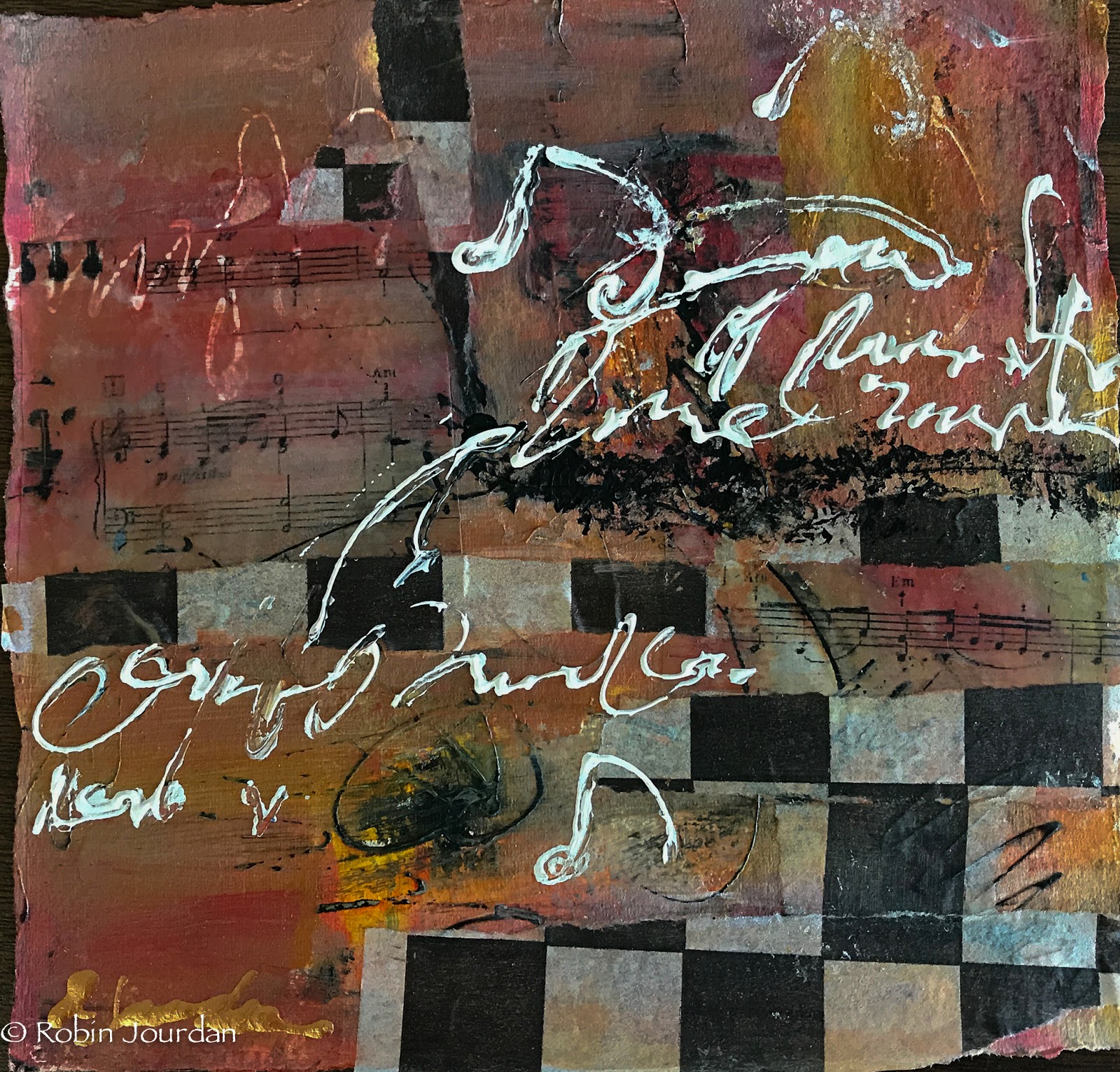
- These are very colorful, both cool and warm mixes.
- Good amount of texture and color combinations
- the collage pieces are fairly graphic, but upon further look, the blue square one has the middle filled up with a "quiet" collage piece surrounded by the bolder graphic pieces
- I wonder: the fact that I took mostly red, blue, yellow with the idea of mixing; and a few other - out of the tube colors; makes me wonder just how much I actually did mix. I like the bright, clear colors, but I wonder how much of my color choices is dictated by the number of tubes on the ride.
- Should I try to mix more? Joan made a comment, that sometimes you can tell exactly which brand/color is on the paper/canvas; and that can be distracting to some people.
- I should try to mix more.
- the one that looks like the french flag is a little distracting too. I tried to mix it up with a little yellow band; but not enough. if I turn it over, it'll look like red-sky at night on a seascape. That's not bad, but not what I was going for. I was just going for a simple construct. Color in this example got in the way. Maybe I should try to overlay or modify the color more?
- I like the start of line work, as much as they seem different, there are some commonalities
- Indecisive to an extent, there is much more I could do with the lines - thick to thin. With the bottle-produced lines, how would I do that?
- I could create a typical line, then smooth the line from one end to middle. That would smooth from widest to narrowest - which is also the width of the original lineI like the area of quiet in each of the pieces.
hmmmm....
Ideas:
R.E.M.: it’s the end of the world …. ‘88…and i feel fine
Comments
Post a Comment